Scatterplot in Plotly Tutorial
Aidan Philbin
This is a tutorial of making scatter plots with error bars in Plotly: https://chart-studio.plotly.com/create/#/
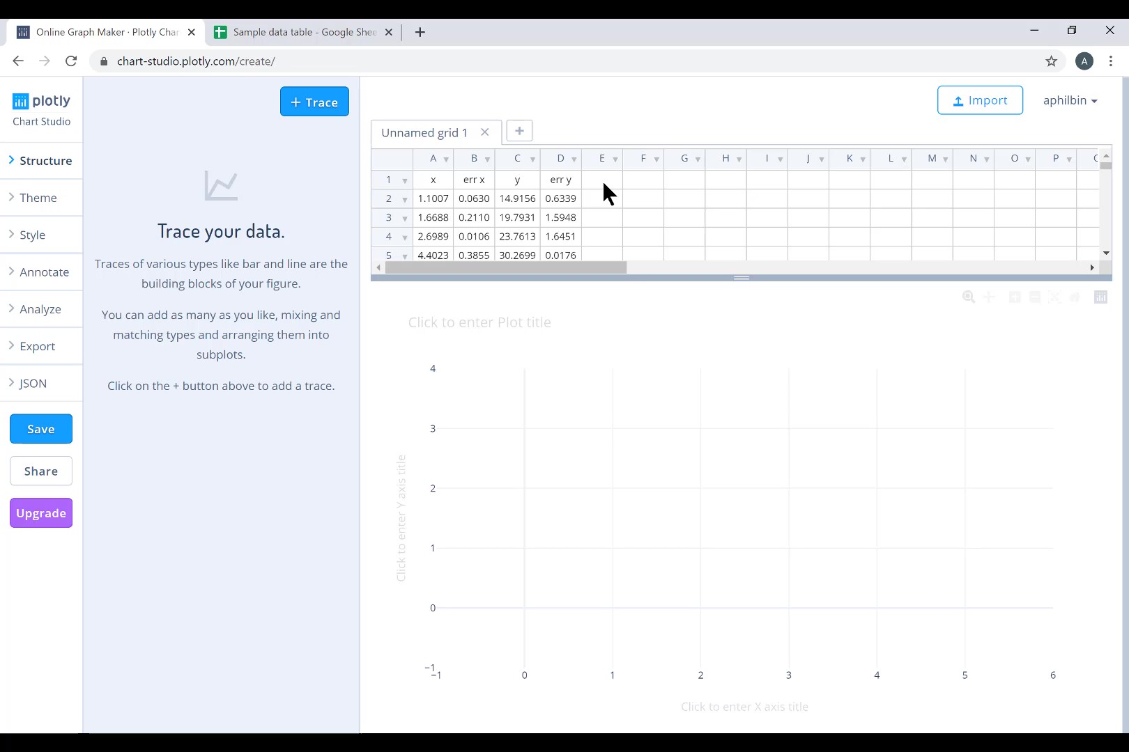
Below is an open window with Plotly running, with x and y data and errors in the spreadsheet portion of the window. Notice the toolbar on the left side of the window, this is what we will be using to make the plot.

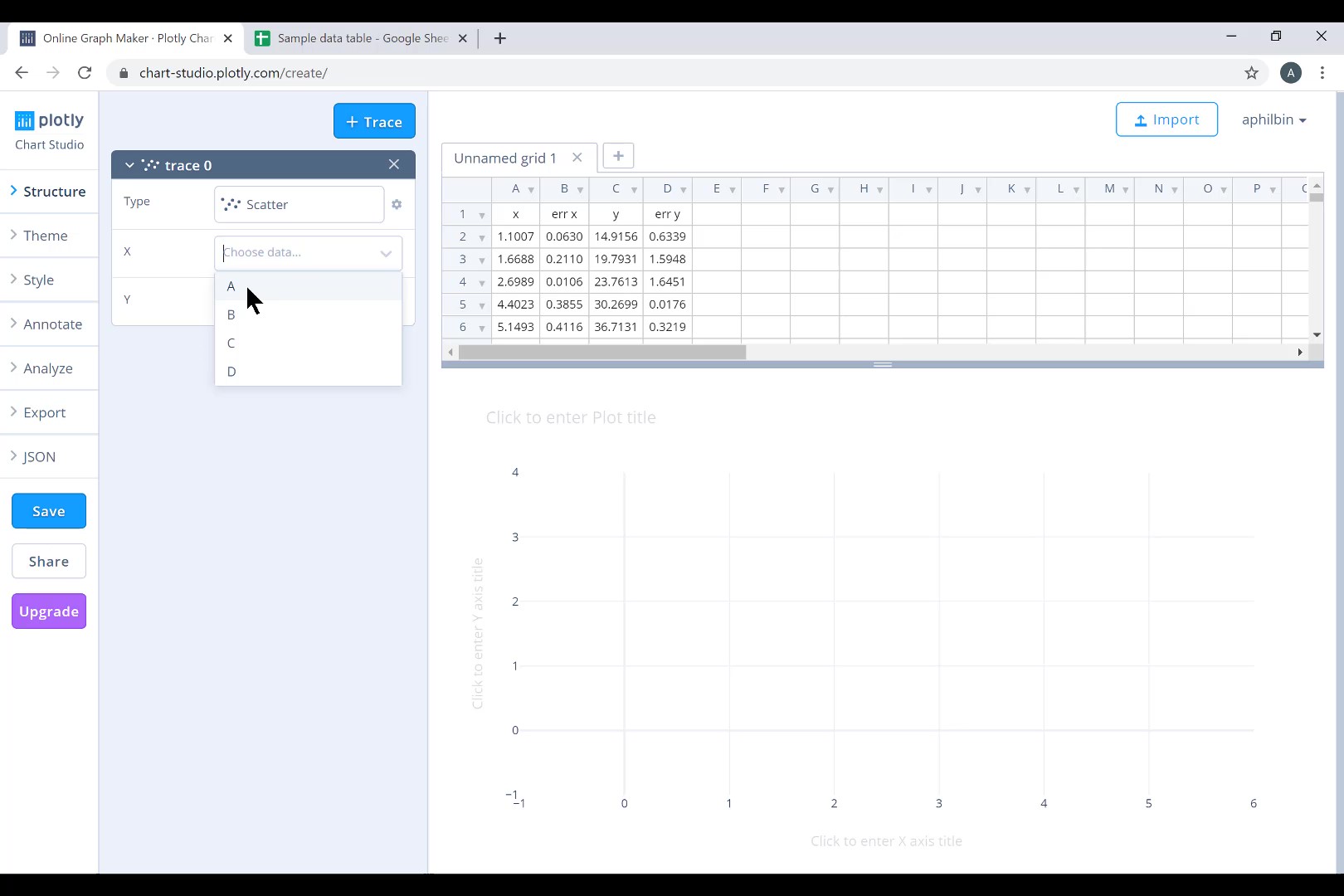
On the toolbar, under Structure>Traces, click the blue +Trace button. Choose Scatter for type. To select which columns are X and Y data, all you need is to choose the letter at the head of the column.

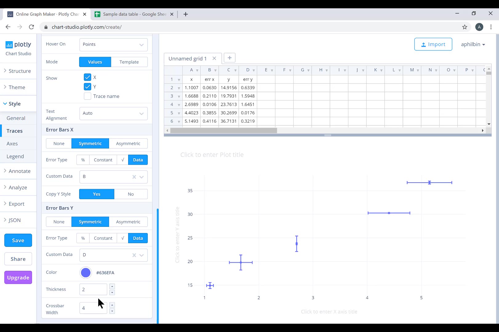
To add error bars, click Style>Traces from the toolbar. Scroll down to the bottom of the menu, and you can choose to add X Error Bars and Y Error Bars. Starting with the x error bars, click Symmetric, for Error Type click Data, then you can choose the column that has the x error data. Do the same with the y error data for the Y Error Bars.

Now that we have our error bars, all that is left is to make the graph more presentable. The thickness and crossbar width of the error bars can be made larger or smaller. The appearance of the data points, both size and symbol, can be changed under the “points” section of the same Style>Traces menu where we found the error bars.

