
Calculating and Graphing the Best Fit Line
Aidan Philbin
The plan for this section is to determine the slope and y-intercept and their uncertainties of our linear scatter plot data in Google Sheets, then to make a plot with two traces on it, one for the scatter plot and one for the fit line.
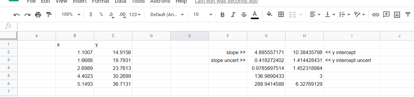
Open up a blank Google Sheet, and copy and paste your X and Y values into it. We’re going to use the Google Sheets function LINEST; read about it here if you like. We will use it like this: type into a cell “=LINEST([highlight y data],[highlight x data], FALSE, TRUE)”. When you hit enter, LINEST will return 10 outputs, but we are only interested in the first four: slope, y-intercept, slope uncertainty, and y intercept uncertainty. Below is a screenshot of dummy X and Y data, and the output of LINEST. I’ve put labels in columns F and I to show where the values we are interested appear.
So now we have m and b, and we can construct the formula for the fit line: yfit = mx+ b. Ultimately we will graph this line in Plotly, we can use the m and b we just found, and solve for yfit for the fit line. I will now be referencing the cells in the figure above, your sheet does not need to be formatted exactly the way mine is, for example your x and y data may be in columns A and B, rather than my B and C. Thus your formulas may not exactly like mine, but your method will be the same. Type “yfit” into the cell D1, and then into cell D2 type “=G2*B2+H2”. This will give us yfit(x=1.007)=m*1.007+b. We would like to drag this formula down to find yfit for all our x values, but we have a problem: when we drag the formula down to D3, the formula increments and becomes “=G3*B3+H3”, but we need to use G2 and H2 for all of these equations. If, in cell D2, we type “=$G$2*B2+$H$2” instead, we will be able to drag the formula down and it will not increment G2 or H2. The $ symbol does this for us, if we type $ before the column (letter) and row (number) of a cell when making a formula, that cell will not increment when we drag the formula. So, type “=$G$2*B2+$H$2” into cell D2, and drag it down through all your data points.
You now have your (unchanged) x and y data to make your scatter plot, and you have your x and yfit data to make the fit line. Graph both these traces on the same plot. Making graphs in Plotly has been outlined in a previous section.
