
Plotting a fit line
Aidan Philbin
In this section, we are making data for a linear fit line, then plotting it. First thing is first, let’s take a look at the raw data and fit in the spreadsheet below.
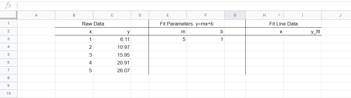
The raw data is in columns B & C. This data has been fit, using LINEST() perhaps, and the fit coefficients m and b are in cells E3 and F3 respectively. The goal here is to be able to make a scatterplot of the raw x and y data, and then to add onto that plot the best fit line. The best fit line is characterized by y=mx+b; for the data above, the line is y=5x+1. We’ll be graphing in Plotly, and Plotly doesn’t graph equations, it graphs points. So, we have to make points on our best fit line, then when we’re in Plotly we’ll choose the chart style to be “line”.
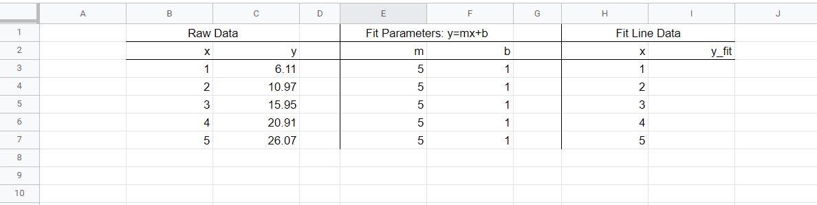
The method we use to find points on our fit line will be solving for y using the raw x data, m , and b. First, drag your m and b values down so that they appear in every row that has data, this will make our formulas increment easily. Then, copy the raw x data column and paste it in the fit line x data column, as seen below.
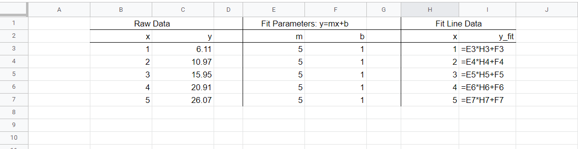
And now we just solve for the y_fit data, using mx+b. See the completed table below, with formulas in column I.
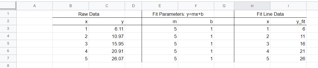
Now with values, the table is:
And we have all of our data! Now, copy the data in columns B, C, and I into Plotly (we don’t need column H since it’s the same as B). Then we click the blue +Trace button to add a trace – trace 0 – of our scatterplot data, then add another trace – trace 1 – of our linear data. Under type, we choose scatter for the scatterplot, and line for the linear data. Don’t worry about messing with “Axes to Use”. See the image below.
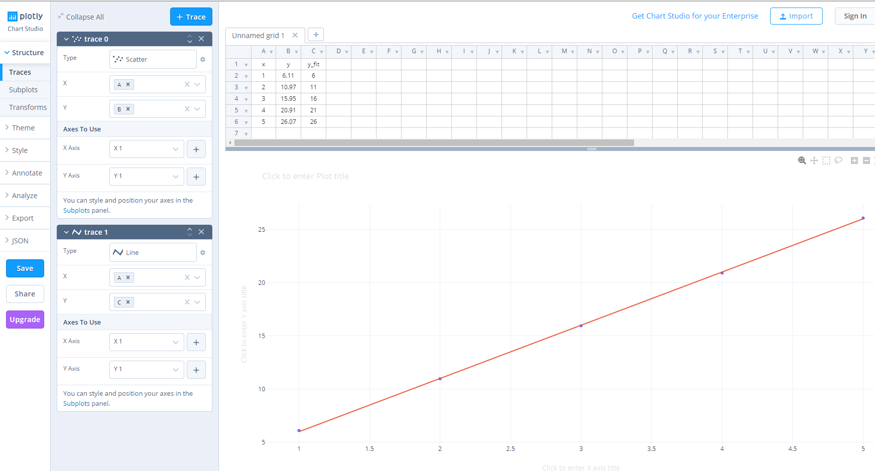
And there we have it: a fit line through our scatter plot!
