
26 What you can learn from a graph
Brokk Toggerson
Equations: millions,
A good graphs is worth still more.
Learning Objectives
By the end of this section, you should be able to…
- List the three pieces of information that can be gleaned from a graph:
- The value.
- The slope.
- The area.
- Be able to determine the units of any of the aspects of a graph.
- From these units, be able to determine the physical quantity each aspect represents.
Graphs are one of the most important tools in the scientist’s toolkit. Open any scientific paper and you are almost certain to see a graph. The reason for this universality is that one graph can contain so much information. All you need to know is how to read it all!
Line graphs
Probably the most common types of graphs in scientific work are scatter plots and line graphs. These graphs are used to show the relationships between two variables in data and potential trends within them (see sub figures a, b, and e in the figure below from Nature).

One particular benefit of line graphs is the amount of information they can contain. Not only can one read the values off the graph, but often the slope and the area underneath contain information as well.
Throughout this unit we will be making and reading graphs to understand the motions that different types of forces can generate.
What you can read off a graph
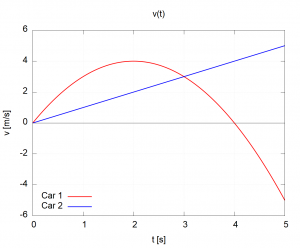
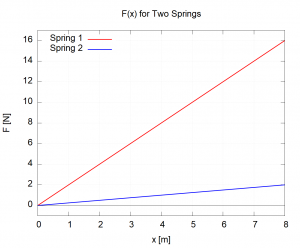
We will now go through the different aspects of a graph: the values, the slope, and the area showing what they can tell you. For ease of discussion, we will consider the following two graphs: the speeds of two different cars as a function of time ( left) and the force exerted by a different springs as a function of how far they are stretched (
 right).
 |
 |
The values themselves
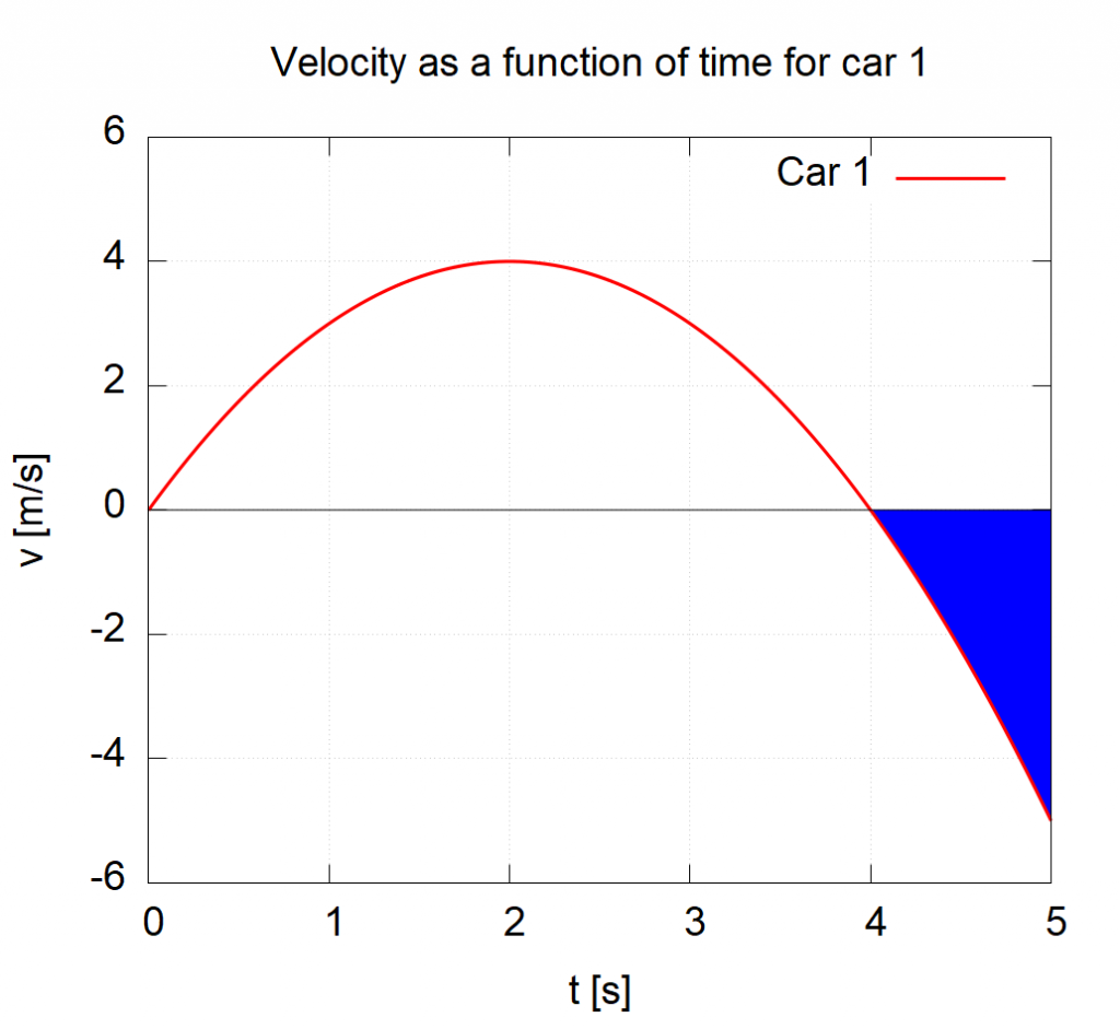
The most obvious thing you can read off a graph is the values themselves. In the case of the graph, we can read that the speed of Car 1 at  is
is  meaning that the car is moving
  in the positive direction (usually considered to be to the right). At
  the speed of Car 1 is
  meaning that the car is moving
  in the negative direction (usually considered to be to the left). At
  we see that the speed of Car 1 is zero (the red curve crosses the
  axis at that point), meaning that the car is instantaneously stopped. In contrast to Car 1, the speed for Car 2 increases linearly with time: Car 2 is moving ever faster.
One particularly interesting point is at  . At this time, both lines have
  meaning that, at that moment, the two cars are traveling the same speed:
  . An important point to remember is that this graph shows the speeds of the cars, not their position or distance traveled. I.e., at
  the two cars are NOT passing each other. They are merely moving the same speed at that instant.
An analogous issue appears in the graph. At  the force of Spring 1 is
  and the force of Spring 2 is
  . These values do NOT imply that Spring 1 has been stretched further than Spring 2. There is, in fact, no way to determine this information from this graph. What these values mean is that, “If I stretch Spring 1 8m, it will exert a force of 16N. In contrast, if I stretch Spring 2 8m, then it will exert a force of 2m.”
Key Takeaway
Pay careful attention to the vertical axis as it tells you what is being graphed. Keep this in mind as you read the values. Sometimes, people plot unusual things and you need to be sure what you are looking at. For example, the moment  in the graph above – the cars are NOT passing each other at that instant. The two cars have the same speed.
The slopes (derivatives)
If you took calculus, the importance of slopes is one of the reasons you studied derivatives. While calculus is not a prerequisite for this class, I will try to make connections for those who took calculus knowing that many of you did. However, this section and the next can be understood without it. The values are not the only information present in a graph. Often the slope (derivative) of the graph can also tell you information. In fact, often the slope of the slope (second derivative) can also provide important information. The information provided by the slopes can even be more important than the values themselves!
Data from the COVID-19 pandemic can provide an excellent example of the importance of slope. Most of the reporting that was in the media primarily focused on the number of cases per day, often including graphs like the one shown below from Minnesota Public Radio. Such plots would often be summarized with text such as “Over the last seven days, Minnesota has averaged around 550 new cases each day with about 256 people per day hospitalized with COVID-19.”[1]

Such quotes, however, lack some critical information. Is the number of cases going up or going down? How fast is the number of cases going up or going down? Such questions are represented by the (or in calculus terms, the derivative) of the graph above. Additional important questions include, “Okay, the number of cases is rising, but is it leveling off or getting worse?” These questions are answered by looking at how quickly the slope is changing: the slope of the slope if you will (in calculus terms: the second derivative). Just as in the number of COVID-19 cases as a function of time graph above, the same quantities, slope and slope-of-slope, are equally important in many domains of science including physics.
The units of slopes
Key Takeaway: 
For ANY quantity  the change in that quantity
  is ALWAYS the final minus the initial:

The mathematical definition of a slope is, as you probably know, “rise over run” or  where
where  . Often, this slope is indicated with the variable
  . This definition of slope tells us how to think about the units of a slope. In the COVID-19 as a function of day graph above, the vertical axis (the
  ) is number of cases. The horizontal, on the other hand is the day. Thus the units of the slope,
 ![[m]](https://openbooks.library.umass.edu/toggerson-131/wp-content/ql-cache/quicklatex.com-5f52151bb67807d3fee0d663ce964fab_l3.png "Rendered by QuickLaTeX.com") (the [ ] indicate that we are thinking about units) are
(the [ ] indicate that we are thinking about units) are
![[m] = \frac{[ \Delta y ]}{[ \Delta x ]}](https://openbooks.library.umass.edu/toggerson-131/wp-content/ql-cache/quicklatex.com-501d7bd994072e23f4b2c4458d3833a5_l3.png "Rendered by QuickLaTeX.com")
In the case of the COVID-19 graph above
![[m] = \frac{\mathrm{cases}}{\mathrm{day}}](https://openbooks.library.umass.edu/toggerson-131/wp-content/ql-cache/quicklatex.com-c6b5d8671c3495fa6bd2295c3a963605_l3.png "Rendered by QuickLaTeX.com")
which we would read as “cases-per-day.”
If we wanted to look at how the number of cases per day was changing (the slope-of-the-slope i.e. the second derivative) the units would be
only now, the is the slope of the cases vs. day graph meaning that ![[ \Delta y ] = \mathrm{cases/day}](https://openbooks.library.umass.edu/toggerson-131/wp-content/ql-cache/quicklatex.com-1bf8e63a6409102c50ad4a3053c3a291_l3.png "Rendered by QuickLaTeX.com") so the slope-of-the-slope is
so the slope-of-the-slope is
![[m] = \frac{\rm cases-per-day}{\rm day} = \frac{\rm cases}{\mathrm{day}^2}](https://openbooks.library.umass.edu/toggerson-131/wp-content/ql-cache/quicklatex.com-9e46f1d6252e75051154a99114e0e651_l3.png "Rendered by QuickLaTeX.com")
which we would read as “cases-per-day-squared” or “cases-per-day-per-day.”
How this relates to physics
How does all of this relate to physics? Well, as we will see in a later chapter, the three kinematic quantities are:
- positionno post — in general this requires three different values: one for each of the three spatial of our Universe. There is one number for the
 -coordinate, one for the -coordinate, and one for the
  -coordinate. These three values are best represented by a vector
- velocityno post — the change in position as a function of time. Since position is a vector, so is velocity:
 .
. - accelerationno post — the change in velocity as a function of time. Since velocity is a vector, so is acceleration
 . It turns out, that acceleration, while probably the least familiar of these three, will be the most important as that is what forces do!
By comparing these formulas for velocity and acceleration to the general expression for a slope  we can see that:
- Velocity is the slope of a position vs. time graph.
- Acceleration is the slope of a velocity vs. time graph.
The units here, even make sense:
- Position has units meters m.
- Velocity, the slope of position, has units m/s (meters-per-second).
- Acceleration, the slope of velocity has units (m/s)/s = m/s2 (meters-per-second-squared).
A technicality we have swept under the rug: slope at a point
In algebra, you can only take the slope between two points: the slope is, by definition, the change in the “rise”  over the change in the “run”

requiring two different points. However, in physics, we often like to talk about the velocity at a instant in time. To do this, we take what is called a limit bringing the two points on the graph which we are using to measure the slope closer-and-closer together until the separation is so small that we can ignore it as shown in the video below. This is actually what the speedometer on your car does: it measures the distance your car travels (using the size of the wheel to measure it) over a very small interval of time. This value then appears on the speedometer.
The areas (integrals)
Just like the section on slopes above, I will occasionally reference calculus in this section. Again, calculus is NOT a pre-requisite for this class, but I will talk about it to help the(significant majority) of you who did take calculus make connections between this course the calculus courses you took.
The other way to glean additional information from a graph is to use the area under the curve. In the case of the COVID-19 graph above, the area between any two dates tells you the total number of cases that have occurred during that interval. For example, if you look at the area under the orange North Dakota (ND) curve, from April to January, it would tell you the total number of cases that were recorded in North Dakota during the year 2020 (start of April 2020 – start of January 2021). If you looked from November to December, that would tell you the number of cases during the month of November.
Units of areas
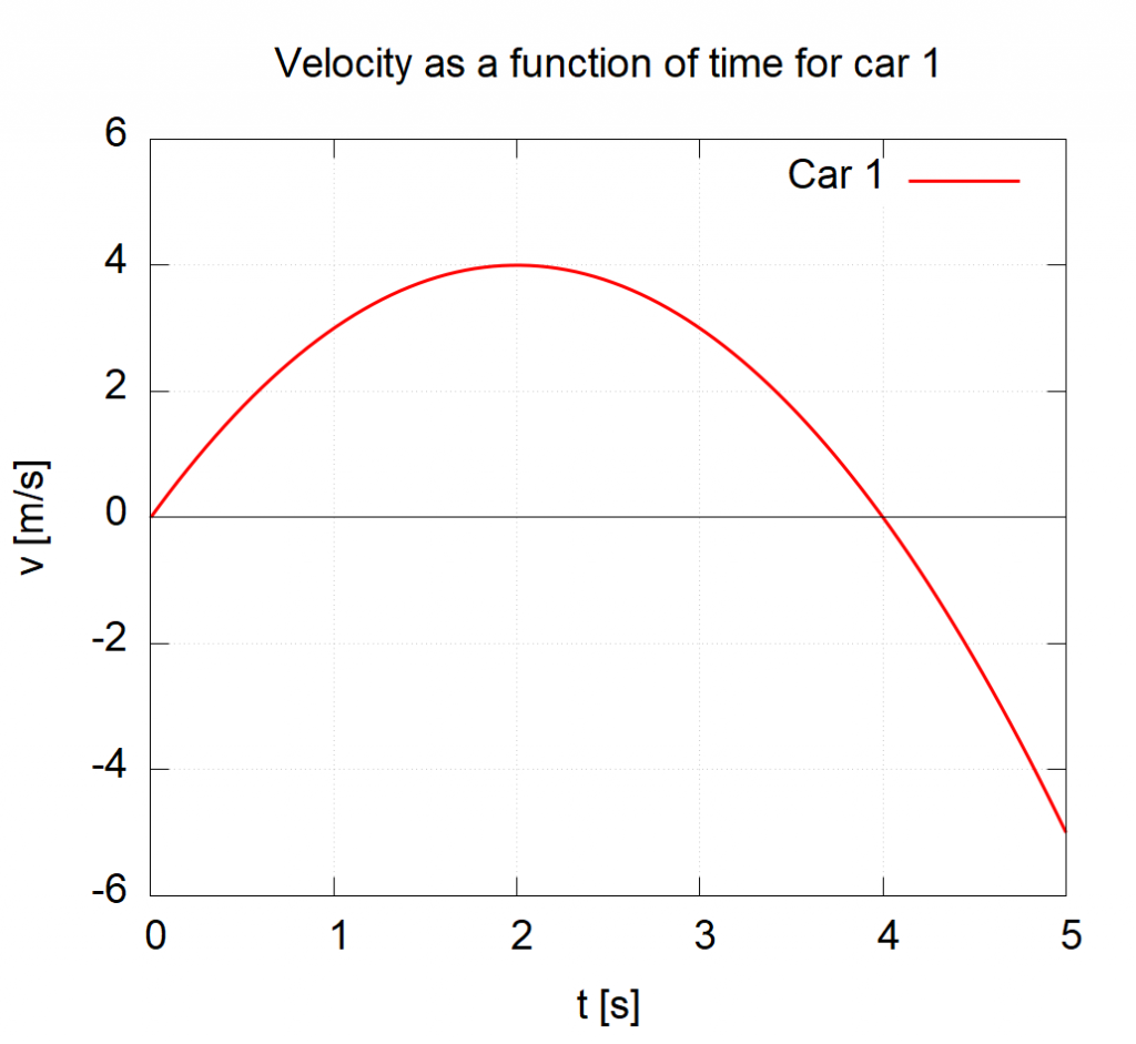
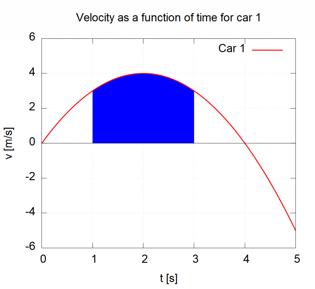
Just like with slopes, the units of the axes can tell us the units of the quantity represented by the area and thereby give us some insight into the physical quantity that the area represents. Let’s look at the graph of Car 1 again from earlier.
The area under this curve between  and as shown below will have the units of (remember
 ![[ ]](https://openbooks.library.umass.edu/toggerson-131/wp-content/ql-cache/quicklatex.com-34c594f271b0407988e0835782a6efc5_l3.png "Rendered by QuickLaTeX.com") tells us we are looking at units):
tells us we are looking at units):
![[\mathrm{area}] = [v] \cdot [t]](https://openbooks.library.umass.edu/toggerson-131/wp-content/ql-cache/quicklatex.com-543f869067b1b032de89bf1d8407d204_l3.png "Rendered by QuickLaTeX.com")
![[\mathrm{area}] = \mathrm{m/s} \cdot \mathrm{s}](https://openbooks.library.umass.edu/toggerson-131/wp-content/ql-cache/quicklatex.com-55b68b48ffd14e87b8bafafdabc84558_l3.png "Rendered by QuickLaTeX.com")
![[\mathrm{area}] = \mathrm{m}](https://openbooks.library.umass.edu/toggerson-131/wp-content/ql-cache/quicklatex.com-483af7291ed6f2e3d91003dec2b3fee4_l3.png "Rendered by QuickLaTeX.com")
which tells us that the units of the area are meters. Therefore the area under a velocity vs. time graph is position!
Interpretation
How do we interpret these values? We have seen that the area between  has the units of meters. What exactly is being measured? In this case, the area represents the change in position
  (see Key Takeaway above). So the area above, represents the position at minus the position at . In this case, the area comes out to be 7.33 meaning that Car 1 ended up 7.33 m further in the positive -direction (usually to the right) from
  to
to  .
.
These values can be negative as shown by the graph below. In this case, the area comes out to be -2.33. How do we interpret this? This means that Car 1 traveled 2.33 m in the negative -direction (usually to the left) from to .
If you are not 100% confident on how to get and interpret these values, don’t panic! we will spend more time on this in class.
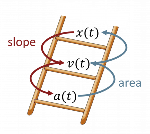
Summarizing the Physics
I like to think of these quantities of ,  , and
, and  as making a “ladder” where you use the slope of the graph to go “down” the ladder and the areas to go “up.”
Homework
22. Ranking Slopes.
23. Units of slope.
24. Thinking about a graph.
25. Thinking more about slopes.
26. Area under triangles.
27. Estimating an area.
28. Areas under semi-circles.
- “Sept. 13 Update on COVID-19 in MN: New Cases Trend Downward; 13 More Deaths.” MPR News, https://www.mprnews.org/story/2020/09/13/latest-on-covid19-in-mn. Accessed 24 Sept. 2022. ↵
The "rise over run" of a graph often written as Δy/Δx
One of the three different independent directions in which you can move: left/right (generally referred to a x), up/down (generally referred to as y), and front/back (generally referred to as z). In some contexts, time can also be considered a dimension, but this consideration is beyond the scope of this course.
