43 Strategies for Analyzing and Composing Data Stories
Angela Laflen
Overview
Data stories are multimodal texts that combine data with words and images to tell a story to or make an argument for a particular audience. They are increasingly common in everyday life as technology has resulted in an information explosion. Data often do not make sense unless someone takes the time to explain them—to tell a story about them. Data stories help to turn raw data into information that readers can understand and use to make decisions. Data storytelling has become an essential strategy for managing data, and students need to cultivate their skills in reading and composing data stories so they can critically analyze the data stories they encounter and in order to use data ethically and effectively in their writing. This chapter offers strategies to help students read data stories critically and use data in composing their own multimodal texts. It demonstrates how to use these strategies by working through the process of analyzing and composing sample data stories.
Introduction
While scrolling through Instagram, the following post catches your attention:
Figure 1. A sample Instagram post. Source: Angela Laflen.
You wonder if the post is true since you know there is a lot of misinformation circulating on social media. Working your way through questions you use to assess whether information is credible, you consider who posted it (your generally reliable cousin), why she posted it (because she is fascinated by UFOs), and its original source (the National UFO Reporting Center, which sounds official). So far, the post seems credible, but what to make of the statistic itself? If you are like many readers, you may tend to either dismiss it out of hand (since everyone knows statistics can be made up) or accept that it’s accurate (since there’s nothing obviously off about it).
These two responses to numerical information are very common. However, neither is particularly effective at helping you make good decisions about the “data stories” you encounter in daily life. In the case of Figure 1, the National UFO Reporting Center is a real organization that allows people to report sightings of UFOs, and the statistic in the post is technically true, but it is also misleading. A quick search of the National UFO Reporting Center reveals that 2018 was anomalous for the low number of reported sightings that year, so the 48% increase reported in Figure 1 is the result of cherry-picking data to create the impression that UFO sightings rose drastically over a 2-year period. Cherry picking of data means we look for particular data and statistics that help to illustrate our point of view, and it is a common way that data are misused in data storytelling. Notice that no complicated math—or really any math at all—was required to determine that this statistic is flawed; just some simple fact checking. Though not all data stories can be fact-checked so easily, it is possible to read many data stories and to write your own credible data stories using basic reasoning skills.
What are Data Stories?
Whether or not you have heard the phrase “data stories” before, you have certainly seen data stories because they are widespread on social media, in news publications, and in advertising of all kinds. In addition to social media posts such as Figure 1, data stories often take the form of infographics (such as Figure 2) or online articles (such as Figure 3). Whatever form they take, data stories are multimodal texts that combine data with words and images to tell a story or make an argument for a particular audience. As infographic guru Alberto Cairo explains, data stories are texts that “give shape to data, so that relevant patterns become visible” (16).
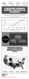
Figure 2. Infographic that charts the increase in language learning using the DuoLingo app during the COVID-19 pandemic. Source: Angela Laflen.
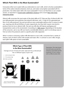
Figure 3. Online news article that compares plant milks based on their CO2 emissions, land use, and water use. Source: Angela Laflen.
You may have even used data in your own writing by including a graph or table as evidence to support an argument in a research paper. In fact, writers have always turned to data for evidence, and data stories of all kinds have long helped make data comprehensible to members of the public, decision makers, and other audiences. Today, though, data stories have become more common because there are simply more data to work with. According to writing and digital studies scholar Brenta Blevins, “the omnipresence of computers in every aspect of human life means we’re recording and capturing ever-increasing amounts of data.” Indeed, according to a 2021 article published in TechJury, “the majority of the world’s data has been generated within the last two years alone” (Bulao).
Although not all of this information is numeric, a lot of it is, and most of it doesn’t make sense unless someone takes the time to explain it—to tell a story about it. Data stories help to turn raw data into information that readers can understand and use to make decisions. In fact, even the way news is reported reflects the increasing importance of data. Data journalism is a type of journalism in which reporters use large databases as sources to produce stories. As they tell complex stories through the use of infographics and data visualizations, data journalists practice data storytelling. Data storytellers rely on multiple modes of communication to make data comprehensible for readers, relying heavily on linguistic (words) and visual (images) modes of communication. The authors of Writer/Designer: A Guide to Making Multimodal Projects explain that the word multimodal
“is a mash-up of multiple and mode. A mode is a way of communicating, such as the words we’re using to explain our ideas in this paragraph or the images we use through this book to illustrate various concepts. Multimodal describes how we combine multiple different ways of communicating in everyday life” (Ball et al., 3).
For example, the UFO post in Figure 1 is a multimodal text. It combines an image of a UFO with a statistic about UFO sightings to create a text that uses images, words, and numbers—multiple modes—to try to convince readers that UFO sightings have increased over a short period of time. You might also wonder whether an Instagram post like the UFO example is really a text. In an essay titled “An Introduction to and Strategies for Multimodal Composing” in volume 3 of Writing Spaces, Melanie Gagich explains that although the word text is “often only associated with writing (or perhaps the messages you receive or write on your phone),” in composition courses the term is often used to refer to “a piece of communication that can take many forms. For instance, a text is a movie, meme, social media post, essay, website, podcast, and the list goes on” (66). An Instagram post is the kind of multimodal text you likely encounter daily.
Why Do Data Stories Matter to Writing?
Even if you recognize how common data stories are, you may wonder why you are reading about them in a writing course; don’t they belong better in a math or statistics course? Data storytelling is about more than being able to perform mathematical operations. Since technology has resulted in an information explosion, data storytelling has become an essential strategy for managing data, and as you develop your skills as a writer, it is important to cultivate data storytelling skills so that you can read data stories critically and are prepared to use data ethically and effectively in your writing. As Janae Cohn discusses in the essay “Understanding Visual Rhetoric” in volume 3 of Writing Spaces, “if we limit ourselves to words in our arguments, we may not successfully reach our audiences at all. Some audiences need visuals to think through an idea, and using graphs and diagrams can express some ideas more clearly than text can” (21).
Often, students encounter data stories when they are assigned to write—or read—multimodal texts such as infographics. Strategies for evaluating and composing multimodal texts more generally are useful with data stories, but they do not provide all the tools we need to work with data. Although often we do not need advanced mathematics or sophisticated statistical knowledge to analyze or compose data stories, we can become stronger readers and writers of data stories by being familiar with critical questions for data stories and the data story composing process.
Scholars have identified four different types of citizens according to the situations in which they use data: communicators, readers, makers, and scientists (Wolff et al., 18). Although scientists—and to some extent makers—do need advanced statistical training to be able to work with data at an appropriate level, for most people, the skills of a communicator or reader will help them “use data intelligently for solving real world problems” (Wolff et al. 18). Communicators are those who “make sense of and tell stories about data for others to digest,” while readers “need skills to interpret data that is increasingly presented as part of their everyday life” (Wolff et al. 18).
This chapter focuses on how you can cultivate the skills of a reader and communicator of data stories. Though the strategies in this chapter will not be sufficient for those who need to work with data as a scientist or maker, they will help you in your writing courses to read data stories critically and use data in composing your own multimodal texts.
Strategies for Analyzing Data Stories
You can apply all of the critical reading strategies you already use to analyze other kinds of texts to data stories. For example, you can preview a data story to get a quick sense of its author, general design, and structure, or you can read a data story rhetorically to consider how the author’s purpose, audience, and other elements of the text’s context influence you as a reader. You can learn more about reading strategies in Mike Bunn’s essay “How to Read Like a Writer” found in volume 2 of Writing Spaces. In addition, to analyze data stories, consider 1) the data source, 2) data alteration, 3) data analysis, and 4) data presentation. Table 1 provides a checklist of questions you can ask during analysis. In this section, I will show you how to use these questions to analyze a sample data story.
Table 1. Critical Questions for Data Stories
1
Data Source
Who conducted the study that this data story is based on and why?
2
Data Alteration
How were the data manipulated from their raw form into the visualization that we see? Are details about the data alteration provided?
3
Data Analysis
What terms are central to the writer’s argument (quantitative and otherwise)? How does the writer define the terms? Who would disagree with the way the terms have been defined, and why? Would the writer’s argument change if the definition of the term(s) changed; if so, how?
4
Data Presentation
Who is the audience for this data story and what are they supposed to do with this information? How do the data, images, and design elements work together to draw the audience into feeling a particular way about the topic of the data story?
5
Data Presentation
What story does this data story tell? What organizational pattern(s) did the writer use to tell that story? How would using a different organizational pattern change the argument?
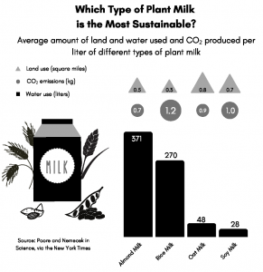
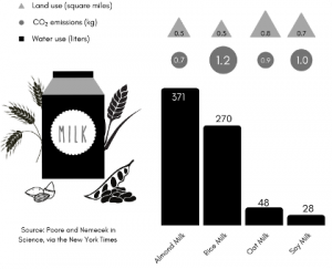
Figure 4. An example of “data journalism,” which refers to short news articles designed for sharing online. This graph was written to be published alongside the news article in Figure 3, but texts like this can also circulate online via social media without their original articles.
Figure 5. Closeup on source information from Fig. 4. Source: Angela Laflen.
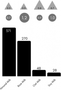
Figure 6. Closeup on bar graph in Fig. 4. that compares plant milks based on their CO2 emissions, land use, and water use. Source: Angela Laflen.
Data Source
In order to analyze this story, our first step is to check the data source. All credible data stories should cite their source(s) of information. This citation serves the same function as citing your sources in an academic research paper: crediting the source of information and allowing readers to find that source for themselves. Do note that data stories do not always use a formal documentation style like MLA to credit sources. Sometimes data stories are so succinct that there is not space for complete citation, and data stories designed to be read online often rely on embedded links to their sources as a way to identify them. Additionally, some of the programs used to create data stories do not support formatting features we have come to expect from word processing programs such as indenting or italicizing specific words. Nevertheless, data stories should provide enough information about their source(s) that readers can find the source(s) for themselves. Also, be sure to do an Internet search for any source that is credited in a data story to make sure it really exists because some deliberately falsified data stories make up fictional sources that sound credible. It goes without saying that falsifying data for use in a data story is unethical.
In the case of Figure 4, the source is credited as Poore and Nemecek in Science via New York Times, but without any other information to help readers find the source such as article title or date (Figure 5). The online article that accompanies the data story includes a link to the New York Times article “Your Questions About Food and Climate Change, Answered,” which includes a link to a peer-reviewed research article published in Science titled “Reducing Food’s Environmental Impacts through Producers and Consumers.” Though it takes a little work to identify the source(s) used in Figure 4, they are the kinds of credible scholarly and news sources that students like yourself are often encouraged to use in making academic arguments.
Data Alteration
Checking the data alteration means asking how the data were manipulated from their raw form into the visualization that we see. Ideally, writers will share details about how the data alteration was performed. Figure 4 is based on data from one table in the New York Times article (Moskin et al.), which lists data on water use in liters, land use in meters, and CO2 emissions in kg and also includes data on cow’s milk in addition to 4 types of plant milk. Figure 4 makes the comparison of different types of plant milk easier to see by moving data from a table into a bar graph to compare CO2 emissions and by using bubbles and triangles to depict the relative sizes of water and land use (Figure 6).
By separating them out, readers can see that the milks compare differently depending on whether they are looking at CO2 emissions, land use, or water use. Figure 4 also omits cow’s milk, which helps the reader to directly compare plant milks to one another.
Data Analysis
We should also ask how data were analyzed and consider the terms the writer used in the data story. Though several terms are used in Figure 4, “sustainable” is the most significant term to examine because it can be defined in multiple ways (Figure 7). Figure 4 implicitly defines sustainability in terms of CO2 emissions and water and land use, but no explicit definition is included. The data story could change drastically if sustainability were to be defined differently.
Figure 7. Closeup on title in Fig. 4. Source: Angela Laflen.
Data Presentation
To check the data presentation, we ask how data, images, and other design elements work together to draw the audience into feeling and thinking a particular way about the topic of the data story. We also ask what the main story or argument is and how it is organized. The presentation of Figure 4 seems rather simple at first. When we look closer, though, we see that the presentation is designed to make reading easy, although the story’s title could be revised for clarity. Different shades of gray, black, and white are used to help distinguish elements of the data story from each other.
Figure 8. Closeup of milk carton image and bar graph in Fig. 4. Source: Angela Laflen.
Most obviously, Figure 4 includes a bar graph and bubbles and triangles to present data, which make the visual comparison of the plant milks easy for readers. The story also includes an image of a milk carton surrounded by the four types of plants included in the comparison of plant milks: rice, oats, soy, and almonds (Figure 8). This imagery helps the reader to visualize the types of milk being discussed in the data story. A large title at the top of the story asks “Which Type of Plant Milk is the Most Sustainable?,” a question the story ultimately does not answer since the data indicate that no single plant milk is most sustainable in terms of carbon emissions, water use, and land use. The title could be revised to highlight this fact.
Strategies for Composing Data Stories
The process of composing data stories is similar to the process you would use to create any multimodal text; however, we have to take extra steps to ensure that we represent data in ethical and rhetorically effective ways.
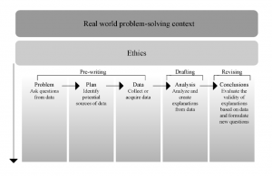
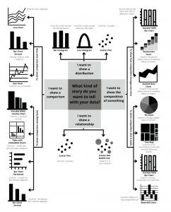
Figure 9 shows how we might visualize the data storytelling composing process.
As this map illustrates, real-world problem-solving contexts and ethics determine how a writer moves through the data storytelling composing process. We can think of them as defining the writer’s rhetorical situation when composing a data story. A rhetorical situation refers to the surrounding circumstances and contexts that shape a piece of writing (usually discussed in terms of audience, purpose, exigence, genre, and rhetor). Data stories, like all texts, are shaped by their rhetorical situation. The real-world problem-solving context includes the reason a writer creates a data story, the audience they are writing to, and how they will disseminate the story. In addition to the real-world problem-solving context, ethics also dictate the choices a writer can make when composing a data story. This means that a writer cannot choose to exaggerate or cherry-pick data just because this makes for a more interesting or persuasive story. All of a writer’s decisions are bound by the need to be as accurate as possible in working with data.
In this section, I’ll show you how I worked through the composing process to draft a story about Americans’ preferences in pizza toppings. The real-world problem-solving context for this story is the need to make an eye-catching Facebook post for National Pizza Day (celebrated annually in the United States on February 9). My ethical obligation as a writer is to accurately report the data I use in my story and to cite my source(s) of information so readers can fact check the story for themselves.
Figure 9. Data Storytelling Composing Process. Adapted from Wolff, Annika, et al. “Creating an Understanding of Data Literacy for a Data-Driven Society.” The Journal of Community Informatics, vol. 12, no. 3, 2016, p. 15. Source: Angela Laflen.
Prewriting Steps
It is common to spend more time on prewriting for a data story than on drafting the story. This is because writers need to work through at least three pre-writing steps:
Asking questions from data
Choosing data sources
Collecting data
Asking Questions from Data
Asking questions from data means thinking about possible questions data might be able to answer about a topic (this does not mean you will be able to find data to answer all of the questions you can think up). In the case of my National Pizza Day post, there are a number of questions I could ask, including: how much pizza do Americans eat each day/month/year? What kind of pizza do Americans like best/least? How do preferences for pizza (types of crust, toppings, etc.) differ by state or region? How much do Americans spend on pizza each year and how does this compare to spending on other types of food? I usually begin a data story by brainstorming lots of possible questions before I start looking to see what data is available to work with. This way, I can adjust my story depending on what I find.
Choosing Data Sources
After I identify questions I might be able to answer with data, I search for possible sources of data. I start my search by Googling “Americans’ pizza preferences,” which yields over a million results. However, given my rhetorical situation, I want to work with a large, national opinion poll, and I also want a source that allows me to see the raw data, which refers to the original data that was collected. There are many fewer options that meet these criteria. In fact, I quickly discovered that YouGov, a British international Internet-based market research and data analytics firm that specializes in market research through online methods, is the best source for my data story. YouGov has published data from a 2021 survey of Americans (over 6000 adults participated from different regions of the country). Since this survey only focused on pizza topping preferences, I can also narrow down the topic for my data story.
Collecting Data
The last prewriting step is collecting data. As you collect data, you have flexibility to further refine or change your topic based on the data you collect. It is important to develop a data story that supports the data you are working with rather than trying to make data fit a narrative you already have in mind, which can result in cherry-picking of data or other data distortions that undermine your credibility as a writer.
Collecting data from a source such as YouGov that makes the raw data from their surveys available online is easy and quick. I prefer to work with sources that let me see raw data because then I don’t have to worry about how data were altered during analysis or for presentation. However, you will often not have access to raw data and will have to work with data from secondary sources, or data that has been reported by others. For example, the data stories in Figures 2 and 3 are based on data reported by secondary sources. Any time you work with data that have been gathered and reported by others, it is crucial to choose data from a credible source that clearly explains how they gathered and altered data and what their purpose was. In other cases, you may conduct primary research yourself and collect your own raw data for the project. In that case, data collection can be the most time-consuming part of your work. For more information about conducting primary research, check out Dana Lynn Driscoll’s essay “Introduction to Primary Research: Observations, Surveys, and Interviews” in volume 2 of Writing Spaces.
Drafting and Revising
Analyzing Data
You begin drafting your data story by analyzing the data you have collected. Analysis involves thinking about the terms you’ll use in your story and how you will represent data for readers. The terms you use can impact how well readers understand your data story and how accurate it is. For example, can you see the difference between saying that anchovies are Americans’ “most disliked” topping versus that they are the “least popular” topping in America? While the difference is subtle, saying something is “most disliked” has a more strongly negative meaning than saying it is “least popular” (which implies it has some degree of popularity). To determine which phrase to use in my data story, I need to know what the original survey asked because that language influenced how survey participants responded. In the case of the YouGov survey, 61% of respondents indicated that they dislike anchovies, so it is accurate to say they are the most disliked topping in the survey.
Another of the main ways that writers analyze data is by deciding whether or not to use a graph to represent it and, if so, what type of graph to use. Sometimes, a simple table will help you present data more clearly than a graph would, and in other cases you might just present a statistic in the text of your story. In any case, your choices should be deliberate and intended to make data easy for your readers to understand.
If you think a graph is needed to communicate data clearly, you should choose the type of graph based on what you want it to show about your data. The flowchart in Figure 10 shows you how you can use the purpose of your graph and the kind of data you are working with to determine what graph might work for your data story. More information about each of these graphs and choosing the graph to use is available at the website Storytelling with Data (storytellingwithdata.com).
For the National Pizza Day post, I want to show a comparison, and specifically a comparison among items (pizza toppings in this case). The flowchart suggests I should consider a graph such as a vertical bar chart, horizontal bar chart, variable width column chart, or embedded table with graphs. Given that I only have one variable to graph—preference for pizza toppings—the vertical bar chart or horizontal bar chart are my best options.
Figure 10. Flowchart to determine graph type based on data storytelling purpose. Source: Angela Laflen.
Create Explanations from Data and Test These with Readers
Though the simplest data stories may just present data in a clearly labeled graph, it is more common for data stories to make a larger argument about their topic using data as evidence to persuade readers that the argument is true. Writers create these larger arguments by combining words and images to help readers understand what is important or meaningful in the data they are working with. Since it takes time to compose multimodal texts that combine words and images effectively, we can borrow drafting strategies from the field of graphic design to help us work efficiently. Specifically, tools called thumbnails and mock-ups are useful to help writers plan the design of multimodal texts.
Graphic designers use thumbnails, which are small, quick sketches of possible designs, to rough out their initial ideas about how they might combine words and images (Figure 11). I like to create several different thumbnails to see the pros and cons of my different ideas. Often, I end up combining elements from different thumbnails together in my final design.
Figure 11. Two sample hand-drawn thumbnails for my pizza story. Source: Angela Laflen.
After you decide on an approach for your design, you create a mock-up, which is a rough layout of a screen or page. Think of your mock-up as a “visual outline of a project” (Ball, et al. 189) that includes the layout, colors, images, fonts, and headers you plan to use for your project. Mock-ups may or may not also include the actual text you plan to use. Although you can create a mock-up by hand, I prefer to create mock-ups using the software program I plan to use for my data story. Several free online programs are available to create multimodal texts including Canva, Piktochart, and Visme, along with pro tools such as Adobe Illustrator. Although these programs can make the composition process easier, document or slide programs (e.g. Word, Google Docs, Pages, PowerPoint, Google Slides, Keynote) can also work.
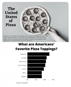
Figure 12. Mock-up of my National Pizza Day story. Source: Angela Laflen.
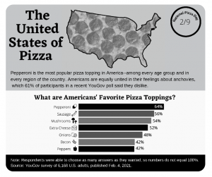
I used Canva to create the mock-up of my National Pizza Day post (Figure 12). I decided to focus my story on how united Americans are in their preferences for pizza toppings. The implicit argument in this story is that there are still some questions on which Americans agree strongly regardless of region, gender, age, politics, or income level. Since pepperoni is Americans’ favorite topping across all these categories, I used a large image of a pepperoni pizza as the focal point for this story, and I wrote a title that communicates the argument of my story about national unity around pizza topping preferences. I drafted short text to present key results from the survey and included a bar graph to show more of the survey results. This mock-up helped me to see that the story has two distinct parts that aren’t clearly linked yet, and I used it to write down a list of changes I wanted to make moving forward. Figure 13 shows how my data story evolved from the mock-up. Though some elements remained the same, including my main argument, I spent time on the images and text to make the story more cohesive. A cohesive data story is one in which the relationship between the different components of the text—the words, the images, the data, and any other elements included—is clear and logical to the audience. For example, in my mock-up it is not clear how the image of a hand reaching for a piece of pizza logically relates to the title “The United States of Pizza.” Similarly, because I used different fonts for the two different parts of the story, there is no clear visual relationship between the parts. I made changes during revision to improve these elements. I included an image of a pepperoni pizza shaped like the United States to relate more clearly to the title. I also used two consistent fonts throughout the data story, one for headings and the other for the rest of the text. The consistent use of fonts creates visual unity between the two parts of the text.
Figure 13. My National Pizza Day Facebook post. Source: Angela Laflen.
The next step in my composing process is to test my story with readers. Based on this feedback, I might make additional revisions to the story. Like all texts, data stories are subject to an ongoing drafting and revision process, and I usually only finish working on a data story because I run into a deadline.
Concluding Thoughts and More Information
This chapter introduced you to data storytelling and to strategies that will help you get started as a reader and communicator of data stories. The main takeaway is that you can analyze data stories critically and use data ethically and effectively in your writing whether or not you consider yourself a “numbers person.” Although these strategies are just a starting point, regular practice reading and composing data stories will help you to improve your analysis and composition skills. I also encourage you to learn more about the process of designing your data story. I touched only briefly on design in this chapter, and I recommend the following for more information:
Janae Cohn’s Writing Spaces volume 3 chapter, “Understanding Visual Rhetoric” focuses on the visual mode and would be useful as you choose visuals for your data story.
Poore, Joseph and T. Nemecek. “Reducing Food’s Environmental Impacts through Producers and Consumers.” Science, vol. 360, no. 6392, 2018, pp. 987-92.
Wolff, Annika, et al. “Creating an Understanding of Data Literacy for a Data-Driven Society.” The Journal of Community Informatics, vol. 12, no. 3, 2016, pp. 9-26.
Teacher Resources for “Strategies for Analyzing and Composing Data Stories”
Overview and Teaching Strategies
This essay introduces data storytelling in the context of multimodal composing. I assign it to students when I introduce multimodality because data storytelling plays a central role in multimodal genres ranging from infographics and white papers to social media posts. That said, the chapter could also be beneficial to help students learning to write about data they have collected through their own surveys or interviews. Without explicit instruction in the use of data, students often struggle to both analyze the use of data in multimodal texts as well as to use data effectively and ethically in their own multimodal texts. Multimodal composition pedagogy prepares students to discuss multimodal texts in terms of different types of media and modes of communication. While this vocabulary helps students to analyze the data stories they encounter and to plan their own data stories, it is not fully sufficient. Students need additional vocabulary to understand the strategies available for working with data. In this essay, I share a checklist of critical questions students can use to analyze the use of data in multimodal texts and apply the checklist to the analysis of a sample data story. I also introduce students to the data storytelling composing process and model this process by demonstrating how I worked through it to produce a data story.
This chapter focuses on introducing strategies for reading and composing data stories, and it does not go into detail about design principles or modes of communication. Consequently, it is best to combine this chapter with additional readings that discuss multimodal composing more generally and the vocabulary of page design. In my own courses, I also provide more information to students about specific graph types to help them make informed choices, and I spend time in class showing them how to use free online programs for composing multimodal texts such as Canva, Piktochart, and Adobe Illustrator. Some of the questions and activities that I use with my students are included below:
Discussion Questions
1. Keep track of the data stories you see on social media over the course of a day or a week. What patterns do you notice in the kinds of stories or arguments made in these texts?
2. Use the critical analysis questions in Table 1 to analyze one of the data stories you saw on social media. Discuss why you think the data story does or does not use data effectively.
3. I suggested that the title of Figure 4 should probably be revised for accuracy. Discuss what a more accurate title for this data story might be.
4. Choose a topic you are working on or have recently worked on. Generate a list of questions about that topic you might be able to answer about it using data. Can you identify good sources of data that might help you answer any of those questions?
5. Use the flowchart in Figure 10 to determine the best options you have for showing data in the following scenarios:
a. You want to show how house prices in your community have changed over time.
b. You want to present data for 7 online stores, their monthly e-commerce sales, and online advertising costs for the last year.
c. You want to show which student services on campus bring in the biggest share of total visitors.
6. Try using a different graph type to represent the data in the horizontal bar chart in Figure 13. Which graph is easiest to read and understand? Why?
7. This chapter includes several examples of data stories. Choose one of them and discuss how you could revise its genre (as one example, you might consider how you would turn the infographic in Figure 2 into a social media post). What changes would you make to the story to suit the changed rhetorical situation?
Activities
The following three activities help to scaffold the data storytelling composing process for students by helping them become familiar with data stories, giving them practice creating different types of graphs, and using free, online programs for composing multimodal texts.
Data Storytelling Scorecard
When I introduce data stories to my students, I like to give them several examples of data stories, from effective data stories to examples that have serious problems in the design or use of data. I put them in groups with a scorecard, below, and ask them to rank the stories on a scale from Great to Horrible.
Directions:
Examine the data story. What is it trying to communicate?
Discuss with your team: Is the story clear? Is it misleading? How could it be improved?
Rate the data story and make a short note about why you gave the rating you did.
Table 2. Evaluating the Data Story
Number
Your Rating
Comments/Notes
1
Great Good Bad Horrible
2
Great Good Bad Horrible
3
Great Good Bad Horrible
4
Great Good Bad Horrible
5
Great Good Bad Horrible
6
Great Good Bad Horrible
After the groups have a chance to rank the data stories, we have a whole class discussion about how we ranked each data story. This is a good way to talk about what makes a story effective and how content and design work together in these texts.
Graph Creation Practice
To help students become more comfortable creating graphs, I use a class day to give them the opportunity to practice making different kinds of graphs. They do need access to computers on this day. I project a simple spreadsheet with population data on it at the front of the class and ask them to enter the data into their own Excel or Google Sheets spreadsheet. Then I show them how to create a variety of graphs including pie charts, horizontal bar charts, vertical bar charts, line charts, and scatterplots. After we work together for a few minutes, I ask them to continue trying out different graph types and to choose the one they think makes the population data easiest to see and understand. Once they choose the graph they think is most effective, I show them how to add and change labels on their graph, how to change the color palette, and how to save and download their graph. In the last section of the class, we share the different graphs students made and talk through their strengths and weaknesses for depicting the data.
Reverse Engineer a Data Story
Having students reverse engineer a data story in class or as homework is useful in several ways. To reverse engineer the story, students have to recreate it using a software program designed for multimodal composing, such as Canva, Piktochart, or Adobe Illustrator (depending on what the students have access to and will use for their own projects). Students gain experience manipulating text and images using the program without having to worry about the content. They see how text and visuals work together in the story, and they also quickly see what the software program is capable of and what its limitations are. This helps them to plan their own projects more realistically and to appreciate the time involved in composing multimodal texts. The entire class can be asked to reverse engineer the same data story that is provided by the instructor, or students can choose to work with a data story they think is particularly effective.
Angela M. Laflen is Associate Professor in the English Department at California State University, Sacramento. She teaches in the writing program in the areas of digital writing, online writing pedagogy, and professional writing. Her published work focuses on writing response practices and digital and multimodal literacies, and her work has appeared in Computers and Writing, Assessing Writing, and the Journal of Response to Writing, among others.